Creating Your Own Blog
In visual arts 9 & 10 you will use a blog account to present all your work. Signing up for a blog is a very simple process, and only takes minutes of your time. A blog is an excellent way to display your photos with no cost to you. Your blog account will be a valuable tool for you to use through out the semester. It will be your communication tool for specific assignments and links to valuable web sites. It will also be a means of assessment for your teacher.
check these examples out:
http://marayacooper.blogspot.com/
http://savannakiff.blogspot.com/p/graphic-arts.html
http://teiganmg.blogspot.com/
The following steps will help you create your account.
Step 1
Step 2
You should now see the Blogger.com webpage “Click” on Create a Blog.
Step 3
It will now ask you to create a new Google account. Follow the directions provided. You are not required to put your age or your birthday. This is privileged information and should remain so.
Step 4
After you have successfully completed your new Google account you have to verify that account by: Entering your country, and your cell phone number. If you don’t have a cell - phone, you may use a friend’s or ask Mrs. Pye or Mr. Mueller. You will then receive a text on your phone giving you the verification code.
Step 5
You will now have a new screen asking for the verification code. Type your code in the designated area. This screen will take you to where you will build your URL for your blog.
Step 6
Customizing your Blog:
You are now ready to customize your blog. The blog account will provide you with a variety of stencils to use. Choose one and then and name your blog. Please insure that you use your whole name in the blog title. For example: John Smiths Photography.
Step 7
You now must link your blog account to your teacher’s account using the following steps:
1. “Click” on Design at the top of your account page.
2. “Click” on Dashboard at the top right hand corner.
3. Go to the bottom of the page where it says ADD and “click”. Add your teacher’s blog address______________________________.
4. Then “Click” Follow. Your teacher’s blog address should now show up on your dashboard.
5. Now report your blog address to your teacher so they can add your address to their blog. Your blog address should look something like this: John Smith.blogspot.com
6. You are now ready to post your assignments on to the bog.
Project 2 Creating your Classroom ID Card
Project 2 Creating your Classroom ID Card


In this project you will simply make an ID Card roughly 3"X4" If your comfortable with using advanced programs thats great, if you are not then programs like Paint.net and Paint are fine as well. Please make sure if you don't understand that you ask Mr. Mueller for assistance.
Project 3
Careers In Graphic Design
Power point Presentation
In groups of two-three research a graphic design career and compile the information into a PowerPoint. Time: You have one week to brainstorm, research, compile and present the information.
Criteria:
Career: what is it? What is the career choice you have researched? What do you ALREADY know about this career (or think you know)
Education: Do you need post secondary education to be hired? What qualifications do you need to enter school? How much does it cost? Please include a short list of potential schools. What skills must you have to be eligible for a job like this?
Tasks associated with the career/job? What are the tasks of the employee? What are the responsibilities?
Pay rate: How much does the employee make (salary)
Technology: What technology is being used, what programs and accessories are in demand for the employee?
Job opportunities: Research current job opportunities and list some of the specifications noted on the ads. Please include the rate of pay (if applicable) and the areas of employment.
Compile the information into a cohesive and informative PowerPoint. You will present the information to the class. Below are some links to sites that may help you with research.
Job ideas:
§ Animator
left and right side of the Brain
http://www.alistapart.com/articles/creative/
http://www.bing.com/videos/search?q=understanding+the+left+and+right+sides+of+the+brain&mid=1D01F0D4042A4B3C56F41D01F0D4042A4B3C56F4&FORM=LKVR11#
This is very interesting, check it out and see what side of your brian is dominate.
Project #3
The Basic Steps to Creating a Composition
In all projects this semester you will be responsible for following the creative process. Comming up with creative ideas best works when you follow these steps. All projects will be marked when the following have been submitted. For example when your projects are complete and on your Blog I will request your creative process. You can even take pictures of your creative process and put them on your Blog if you like.
1. Webbings - random ideas you may want to explore.
2. Thumbnails - small quick sketches originating from your webbings.
3. Rough Copy - one idea selected from your thumbnails that is explored further, usually a larger drawing.
4. Good Copy - finished and refined product usually done in colour and can be hand drawen or done on the computer.
The following will give you an idea of how I assess your work. You will notice that I put a significant emphasis on the creative process. So make sure you develop a good habit early of using that process.
Webbings /10
Thumbnails /10
Rough Copy /10
Good Copy /20
Total Mark /50
Project #4
Introduction to the Elements of Composition
The elements of composition are the building blocks of design. You need these elements to build sucessful designs in all forms of art, just as a carpenter would need a variety of building materials to build a house ie. cement, lumber, nails, paint etc. Together these elements in combination form a finished composition. There are seven basic elements of design. In this unit you will learn more about those elements by creating a series of small assignments. (see web site for further details)
Line, Value, Shape, Colour, Texture, Form, Space
http://www.digital-web.com/articles/elements_of_design/
http://photoinf.com/General/Robert_Berdan/Composition_and_the_Elements_of_Visual_Design.htm
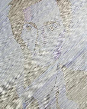
Assignment #5 The Element of Line & Value
For this assignment the student will recreate an image using just parallel lines.
Supplies: You will need are: a uniball pen, pencil crayon, ruler, paper and a magazine image.
Step 1 - Choose an image that demonstrates excellent contrast and values. Contrast is the difference between colors and values, or other art elements. Step 2 - Using tracing paper trace and isolate the contrasts and values into specific shapes. (light pencil)
Step 3 - Then using a uniball pen decide the angle you are going to use and begin placing in your parallel lines. Remember the line density is going to depend on the contrasts and values within your image. Think carefully about the strategy you will use in your drawing or how you want it to look?


http://vimeo.com/2671575
http://www.bing.com/videos/search?q=paralel+line+drawings&mid=2BC2149C536747D549332BC2149C536747D54933&FORM=LKVR14#
Assessment
Image details - /10
Line Technique - /10
Colour Use - /10
Total Mark - /30
Assignment # 6 The Element of Colour & Negative Space
In this assignment you will learn about specific colour combinations as well as negative space.
Using the the creative process you will create a design using colour combinations from the colour wheel and then convert the design into negative space. You can try a couple different approaches to making your design interesting. You can create your design then collage it using magazine clipings or text, or you can use construction paper. Remember the more creative you are the better mark you will get.
1. webbings 10 marks
2. Thumbnails (minimum of 10 designs) 10 marks
3. Rough Copy (choose 1 of the 10 designs) 10 marks
4. Good copy (refine your rough copy and use colour) 30 marks
Total Project Marks /60
What is Negative Space?
Negative space, in art, is the space around and between the subject(s) of an image. Negative space may be most evident when the space around a subject, and not the subject itself, forms an interesting or artistically relevant shape, and such space is occasionally used to artistic effect as the "real" subject of an image. The use of negative space is a key element of artistic composition.
In a two-tone, black-and-white image, a subject is normally depicted in black and the space around it is left blank (white), thereby forming a silhouette of the subject. However, reversing the tones so that the space around the subject is printed black and the subject itself is left blank causes the negative space to be apparent as it forms shapes around the subject, called figure-ground reversal.
http://www.tutorial9.net/articles/design/enhancing-your-art-with-negative-space/


________________________________________________
What is Graphic Design?
Dictionary.com defines graphic design as “the art or profession of visual communication that combines images, words, and ideas to convey information to an audience.” A graphic designer is responsible for arranging and using elements on different types of media (such as a poster, a package or a website), most likely with the use of a graphics software program such as Adobe Illustrator, Photoshop or InDesign.
Project # 7 Commercial Art
Assignment The Logo & Slogans
History of the Logo
http://www.logoorange.com/logodesign-A.php

To start this assignment check out the website below. You will find a three step process that will help you get started on your logo. Good luck and have fun!
The Three Basic steps of Creating a Great Logo
-Do you just want it to say a name or do you want it to be something truly unique?
-Will the logo be used only for your site or all future advertising?
-What’s the final look going to be?
http://www.napleswebdesign.net/creating-a-logo/
http://www.teachingonline.org/Logodesign.html
Here are some other neat ideas using negative space & logo's.
http://www.graphicdesignblog.org/brilliant-negative-space-logos/
http://pelfusion.com/inspiration/using-negative-space-effectively-in-logos/
Assignment Criteria
Create a Logo for one of the following categories, or use some of the examples above for inspiration.
sports team or equipment, food brands or industry, music groups or companies, automotive, car brands or auto parts, or you can choose a category of your own.
Remember this logo is your own creation using other people creations is a copy right violation.
Logo assignment should include:
1. Webbings
2. Thumbnails
3. Rough Copy
4. Good Copy (a finished refined logo in colour, mounted on and presented)
5. Computer generated logo completed on paint.net (pending down load available below)

Slogan Examples - there is some catchy slogans on this web site.
The man from Del Monte says yes - Del Monte
"The best tires in the world have Goodyear written all over them." Goodyear Tires Advertising Slogan "It keeps going, and going, and going..." Energizer Batteries Advertising Slogan |
http://startup.relishspot.com/logo-template-edition-with-paintnet/
Project #8
Experimenting With Fonts
A font is a design for a set of characters. It is a blend of typeface, size, spacing, and pitch. It defines the way each character looks. There are literally millions of different fonts available with different applications. For more information see here:


In this project you will experiment with different types of fonts. Fonts are widley used in the commercial art. There are thousands of expressive fonts that bring style and creative impact in the commercial art field. In this assignment you will be responsible for creating your own font. (see the above for examples)
Step 1 research different types of fonts
Step 2 create a font that best suits you or describes your character (this is your own creation)
Step 3 find 3 more previous fonts that best describe or suits your character using verbs.
Step 4 cut and paste all fonts onto construction paper and present.
Step 5 Take fictures of creative process and post on blog. Make sure you comment on your project.
For example:
Mr Mueller
Active
athletic
Artistic
Intense
Project #9
Creating your own magazine Cover
In this assignment you will create your own magazine cover. This is a fun assignment, make sure you are creative. Keep your subject matter is clean, appropriate and in good taste.


Steps to Creating a Magazine Cover
Step 1- brainstorm using webbings some ideas you would like to explore
Step 2- Pick 1 of your ideas and make 8-10 thumbnail designs.
Step 3- Pick your favorite thumbnail and sketch out a rough drawing, experiment with colour and layout design.
Step 4 Create a hand cut magazine cover (see example on the bulliten board in the classroom.)
Step 5 Create a finished magazine coppy on Paint.net or one of the provided magazine templates.
Step 6 Place your computer generated magazine cover on your bog under graphic arts.


By: Mr. Mueller By: Nick Phillips By Chris Walker


By Connor Iannone By: Emily Fraser Natalie Joseph
END OF TERM 1
Complete all projects and submit on to your blog.
Please have all projects from 1-8 completed
Project # 10
Soft drink label


.jpg)

Demensions Should Be: 8"x 3" Resolution 300
For this assignment you will create your own soft drink label. You have had experience with logo design and fonts. Use this experience to create a well thought out and refined soft drink label. Be creative and make it unique. When your finished with it post it to the blog, then print it off in colour and fasten it to a bottle. Remember you want to make this label look professional as professional as posible, so include elements like nutritional labels, barcodes
Step 1 Webbings
Step 2 Thumbnails
Step 3 Rough
Step 4 Computer Generated Good Copy
Bonus Go to Jones Soda Design Below and design your own Jones Soda label.
Project # 11
T Shirt Design & Silkscreaning

In this project you will create your own 8"10" T-shirt design and transfer that design on to a T-shirt. Remember it is important to consider all the design concepts you have learned so far in this course.
Also it is very important to remember that using copy righted logos and imagery is a copyright violation. Please create your own images and Ideas!
Also it is very important to remember that using copy righted logos and imagery is a copyright violation. Please create your own images and Ideas!
You are responsible for supplying your own T-shirt
1. Check out the web for ideas, then use the creative process webbings, thumbnails, rough,
good copy (computer)
2. Consider the font style remember fonts can be very expresive and can add a great dynamic to your t-shirt.
3. Colour combinations: This is going to be a two colour shirt, the first colour being your T-shirt colour, the second colour being the colour of your silk screaning ink. Remember the colour combinations you learned in the elemnt of colour early in this course. You want your colours to work together, so that your T-shirt is eye catching and appealing.
4. When considering your idea make sure that is tasteful, there should be nothing that would be considered offensive. Your T-shirt can be expressive and creative, with out it being distasteful.
T-Shirt Spects- Size 8"x10" No larger, as it will not fit on the screan.
Project should include the following:
1. Webbings
2. Thumbnails
3. Rough copy
4. Good copy (posted on blog)
5. Finished silk screaned T-Shirt
Basic steps to follow when creating your T-Shirts
1. Webbings, Thumbnails, Rough Copy
2. Good Copy (printed black and white)
3. Transparency - use photocopier in the library
4. Prepping Your Screan - Use high pressure sprayer in back sink until screan area is perfectly clean.
5.Getting screan ready to transfer image.
a. coat screan with green emulsion.
b. put screan in a dark place to dry
c. after screa is dry expose it in the exposure unit for 15 min.
d. wash screan with high pressure sprayer for 10 min or until your image is clear of emulsion.
6. Printing your image on to your shirt.
a. using packing tape tape off all areas that you dont want printed. (paper saves on packing tape)
b. place screan in Octopus and make a test print on a piece of paper.
c. check for flaws if good proceed to shirt.
d. make sure shirt is square and straight on the octopus bed and that it lines up with the screan.
e. squeejee ink through screan image then lift screan off of the shirt.
f. remove shirt from octopus and place in the flash dryer to cure the ink.
g. Hang Tshirt to dry.
7. Clean up and clean all screans and put away supplies. When your complete show Mr. Mueller in order to have shirt marked. Remember No Clean Up No Mark.
8. Compile project on to blog.
Here is an interesting video's on how the pro's produce a T-shirt
Check out these T-Shirt Designs
Basic Silkscreaning Steps
Assignment #12
‘Personal Motto’- Pin design
Criteria:
Criteria:
Using the design process, please come up with a series of thumbnail sketches. Think about your personal philosophy or motto and design a pin. This pin may have image or no image. Maybe your motto simply be an image. It is up to you. You may draw, design on the computer or collage.
I will be looking for: 8-10 buttons posted on your blog. Then choose 1 to make into a button.
Make sure you focus on the following:
Make sure you focus on the following:
· Neatness of design
· Legible text
· Appropriate language and imagery
· Creativity
*Remember if a found image is not changed 60%-it is against copyright law
Image size:
You may create a regular 8x10 document but create a circle with a 2 ¾ inch diameter. You will fill the circle and cut it out.
Procedure:
· Using the BUTTON MAKER simply put the pin side down
· The metal lid on top
· Apply the drawing/computer design
· Put the small plastic circle on top
· Press the lever to the “1” position
· Press down
· Put the lever to the “2” position
· Press down
· Lift up and voila! You have your pin.